Through the Lens: Elizabeth Kezia
Indonesian photographer on ‘Grand Hotel Paradox’
‘Through the Lens’ is a series that explores in detail images from fashion image-makers in Southeast Asia, shining a light on their creative and technical processes.
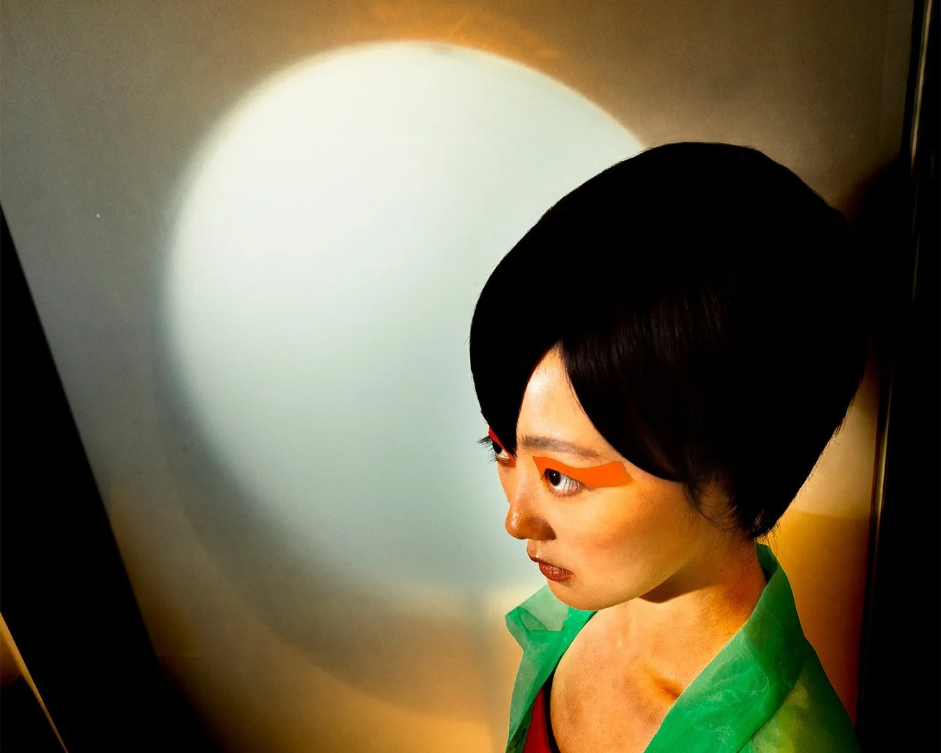
Elizabeth Kezia, ‘Grand Hotel Paradox’, 2021. Image courtesy of the photographer.
Based in Hong Kong, Elizabeth Kezia is an Indonesian photographer whose visual language exists between still and moving images. Kezia’s background in new media art plays a huge influence on how she approaches her image-making practice, using emerging technologies as a medium to deliver her visual concepts. In this interview, Kezia reflects on ‘Grand Hotel Paradox’, a photo series she created in 2021 for PAP Magazine, and how the project pushed her toward interdisciplinary boundaries.
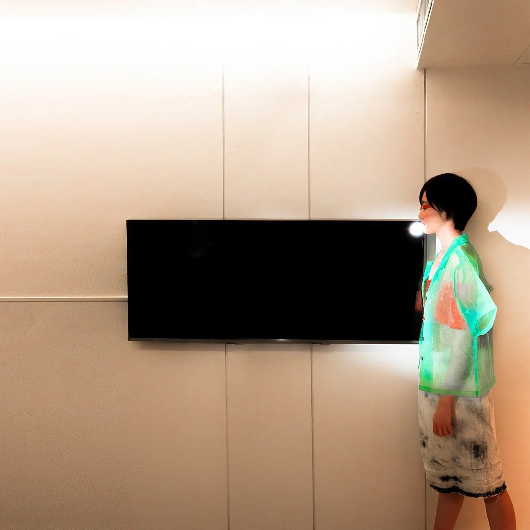
Elizabeth Kezia, ‘Grand Hotel Paradox’, 2021. Image courtesy of the photographer.
Could you describe your ‘Grand Hotel Paradox’ photo series?
Grand Hotel Paradox explores the infinite possibilities within a two-dimensional plane of an image. It is an imaginary proposal to respond to the problem of limited space, which was reflected in both the physical shooting space and the bounding rectangle of the final digital photography.
What is the concept behind it and how did you arrive at this theme?
When I plan a project, I usually begin with a problem and utilise the project as a way to come up with imaginary, possible solutions to it. The idea for ‘Grand Hotel Paradox’ stemmed from my frustration with limited space and access to a photography studio, and I started to think about how to fit infinite rooms or space for the project.
In response to the problem, I was inspired by Paradox of the Grand Hotel, a thought experiment that the German mathematician David Hilbert came up with, where there is a hotel with an infinite number of rooms with guests in each of them, then there are an infinite number of arriving guests. The experiment asks how to fit the new infinite set of guests into an infinite number of rooms. You can intuitively say that they could be put in the very last room. The problem is that you cannot pinpoint which one is the latest occupied room because the number of pre-existing guests is infinite. However, you can move the guests around and fit the new guests in between. The point is that it demonstrates the concept of the infinite as having an infinite possibility to fit within itself.
What would you like to communicate through this photo series? Are there any specific elements in these images that you would want people to pay attention to, and why?
The photo series is an extension of the aforementioned mathematical concept, applied to the way I see any small, ostensibly limited space and any object with a bounding area. Technically, almost all objects in the world can be defined by a finite area and volume.
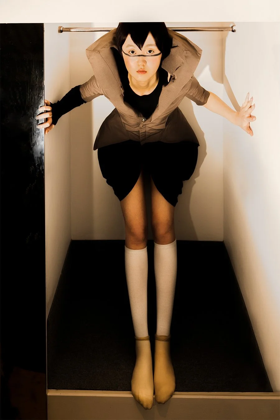
The shooting location, which is a hotel room, is also a key factor in the photoshoot outcome. The hotel's rectangular room layout symbolises the traditional illustration of a bounding area, which is a finite concept. Therefore, utilising the aspects of the hotel room, the images significantly emphasise rectangle shapes and rectangles within the rectangle.
To further convey the photoshoot concept, I also took the distribution of the photo series into account. As the images would be posted to online platforms and social media, I edited one of the images into the format of a continuous Instagram story, taking the viewer from one of the room's doors to another which continues to the end of the hotel's hallway.
What camera and lens were used to shoot the photographs? Are there any specific techniques that you applied when shooting the images?
I used a Sony digital camera and a Godox flash. I am not big on on-production photography techniques unless it is required to express the meaning and purpose of my works. In this case, post-production is more suited since I wanted to break from the two-dimensional property that is inherent in a raw, unretouched camera image.
Could you tell us more about the image-making process?
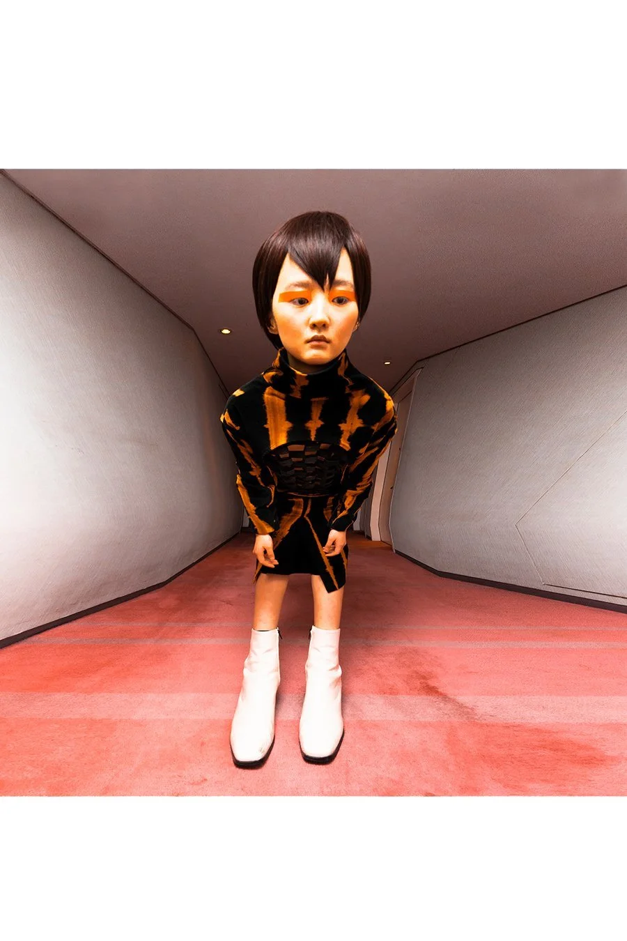
Most of the images were photoshopped to heighten the distortion of the set and the human subject in it. The colour and mood of the project are hyper versions of the actual hotel room and environment. That means the existing tungsten lighting is made more orange and more saturated, and wall corners and furniture edges are made sharper and more distorted.
Another tool used is Blender to render the animation that initially shows the hallway, which then unfolds to reveal more images that are shot in different corners of the hotel room. The placement of the images reflects the actual layout of the hotel room. The unfolded image eventually closes onto itself, forming a room, and then the camera zooms out to reveal an infinite number of similar rooms.
Elizabeth Kezia, ‘Grand Hotel Paradox’, 2021. Image courtesy of the photographer.
You studied new media art at City University of Hong Kong while pursuing a career in fashion photography. How have your studies impacted the way you carry out this project?
I have never truly considered myself as a fashion photographer. I am more of a concept devotee. Fashion is definitely one of the tools to support the project idea, but in the end it is one of many ways to accomplish the intended concept.
I cannot deny that my studies is a huge influence in shaping my model of thinking. It opens my mind, shifting my thought process to be interdisciplinary. I learnt programming during my studies at university and this skill helps me in depicting one of the central ideas of the project, which is the concept of loop.
“I have never truly considered myself as a fashion photographer. I am more of a concept devotee. Fashion is definitely one of the tools to support the project idea, but in the end it is one of many ways to accomplish the intended concept.”
Did you work with a team or collaborators in this project? How has the collaborative process been?
Although the project idea predominantly came from myself, it would not have been done if it weren't for teamwork. For the styling concept, I consulted with my good friend Nisham Limbu, while the makeup was done by Candy Chung. At the beginning of each photoshoot, I would brief the model on the concept and instruct them to act as a character instead of just modelling. A lot of times, the models would do something out of our expectations and I would follow in the new direction. This makes the photo shoot feel more like a collaborative live performance.
Elizabeth Kezia, ‘Grand Hotel Paradox’, 2021. Image courtesy of the photographer.
Elizabeth Kezia, ‘Grand Hotel Paradox’, 2021. Image courtesy of the photographer.
You were also credited as the stylist of the photo series. How did the styling concept take part in delivering the narrative of the images? How did you bring the aspects of styling and photography together?
The styling reinforced the idea of space and volume manipulation. For example, in one of the images, the pants were stepped on as the model stood on a stool, creating an illusion of a taller subject that reached the height of the hallway.
In another shot, the coat with a checkered pattern that the model wore is reminiscent of a grid area, which is a calculated space. In general, the styling is a medium to fit the model’s body as a fixed volume into the different space around her.
Elizabeth Kezia, ‘Grand Hotel Paradox’, 2021. Image courtesy of the photographer.
Elizabeth Kezia, ‘Grand Hotel Paradox’, 2021. Image courtesy of the photographer.
The styling choices prioritised sharp-edged and form-dependent pieces that mimic the angular quality of a room and the angle perspective of the shot. The oversized fit of the garments and wearing them in an unconventional way supports the goal of the project, which was to find a way to expand a limited space infinitely. In addition, the styling also served as an augmentation of the existing furniture around, as shown in one of the images where the skirt worn by the model extends to the rim of the bunk bed below.
Elizabeth Kezia, ‘Grand Hotel Paradox’, 2021. Image courtesy of the photographer.
Elizabeth Kezia, ‘Grand Hotel Paradox’, 2021. Image courtesy of the photographer.
Which fashion photographer’s work has inspired you most in the making of ‘Grand Hotel Paradox’?
In general, I did not refer to any fashion photographers for the project, but one of the photos is a reference to Coperni's backstage image, shot by Gorka Postigo.
I usually realise that my project resembles another artist and/or art style when I finally finish and review them. I feel that my artistic reference accumulates into an unconscious stream, that they become an inevitable footprint as I make my own artwork. For example, I found that one of the images in the series is in the Cubist style.
Elizabeth Kezia, ‘Grand Hotel Paradox’, 2021. Image courtesy of the photographer.
As a fashion photographer with a background in new media art, how has the development of technology and the ever-evolving media landscape impacted your image-making practice?
Technology adds a complex of layers to the underlying concept. I believe that every concept has been executed in this world. However, the ever-changing technology landscape recontextualises each concept into new thoughts and branches, offering a new lens h that is relative to the current times.
In my work, if the concept is the genetic material of the work, the technology is the protein that interprets into whatever it may be. New media is essential to my work as much as a brush is to a painter. Technology helps me to be unattached from the conventions of photography and/or visual works. For me, technology has a broader function in the sense that it could be tuned to influence different biological senses. Therefore, it gives me a fun challenge as a conceptual photographer to create works that take into account all the possible reactions from an audience.
“New media is essential to my work as much as a brush is to a painter. Technology helps me to be unattached from the conventions of photography and/or visual works.”


